

Carriage is a wedding catering mobile app for Japanese users created as a personal project using the Sharpen Generator. The goal for this project was to create a catering app that solves common user pain points when planning catering for a wedding. It was also a priority to design this app for a Japanese audience.

I created a plan for my design process, beginning with the the define/empathize phase where I would further understand the problem that come with organizing catering for a wedding. Then I planned to conduct research on Japanese weddings and interview users who have organized weddings with catering in the past. The next steps were creating design deliverables for this wedding catering app and testing users, gathering insights, and iterating the product. I wanted to complete this project in three months, allotting approximately 2.5-3 weeks for each phase.


I did competitive analysis of wedding catering applications available in America. Finding that there were gaps in easy mobile wedding catering, searching for catering by quality, and being able to access a database of caterers to browse without creating an account. Many of the wedding catering online services did not have a functioning mobile app.
I also did extensive research on Japanese weddings and their customs. I found that current Japanese wedding food was often colorful traditional sushi arrangements, different types of fish, and sometimes a variety of dishes that could be considered more western. In this generation of weddings, food choice is often left up to the individual couples -as strict adherence to tradition is decreasing.
I interviewed five target users, people between the ages of 20-60 who have been married and used a caterer at their wedding. Participants were asked about their experience organizing a wedding with catering and what would have made the process easier for them. Users responded as following when asked about the difficulties they encountered:
I discovered that there were consistent pain points that existed across many user interviews. Such as:

I created a user persona to represent an average user for the wedding catering app. Our persona, Naomi, has the goal to serve the food she desires at her wedding while also having vegan options for some of her guests. She is frustrated by the out of date menus and difficulty contacting the caterers.
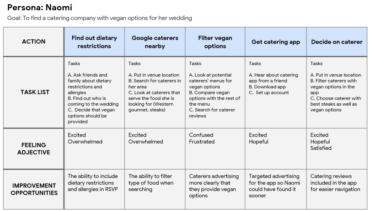
I create a user journey map for persona Naomi in the scenario that one of her family members informed her that they and other guests were vegan. Here we walk Naomi through the task of searching for a catering company with vegan options. With the ability to search for vegan options, her task becomes much easier.

I created a big picture storyboard for our persona, Naomi. Here she is illustrated finding out that she has a family member and other guests attending her wedding that are vegan. Her fiancé shows her the wedding catering app that allows for filtering, and she searches for vegan options.


Low fidelity digital wireframes of the home, catering browsing, and messages screens. The search function in browsing allows for users to add filters to find the ideal caterer for each user. The messenger feature would allow users to communicate directly with their caterer.

I created a low fidelity prototype of the wedding catering app in Figma. Prototype allows users to create an account, create an event, search for a caterer with filers, and "pay" for orders. I also included the ability to access messages to communicate with caterers.

After a round of user testing, I created a high fidelity prototype for the wedding catering app in Figma. I illustrated the logo using Apple Procreate. Search ability and navigation were greatly improved on.


Two in person, moderated usability studies were conducted for Carriage, during the low fidelity prototype phase and the first high fidelity prototype page. Participants were people who have had a wedding with catering in the past, age 20-60.


High fidelity mockups of the final design for the welcome page, event, and filter pages. Filters will allow users to search for specific options within cuisine type, dietary restrictions, and price ranges. This solution should allow users like Naomi to easily find something for guests that have dietary restrictions.


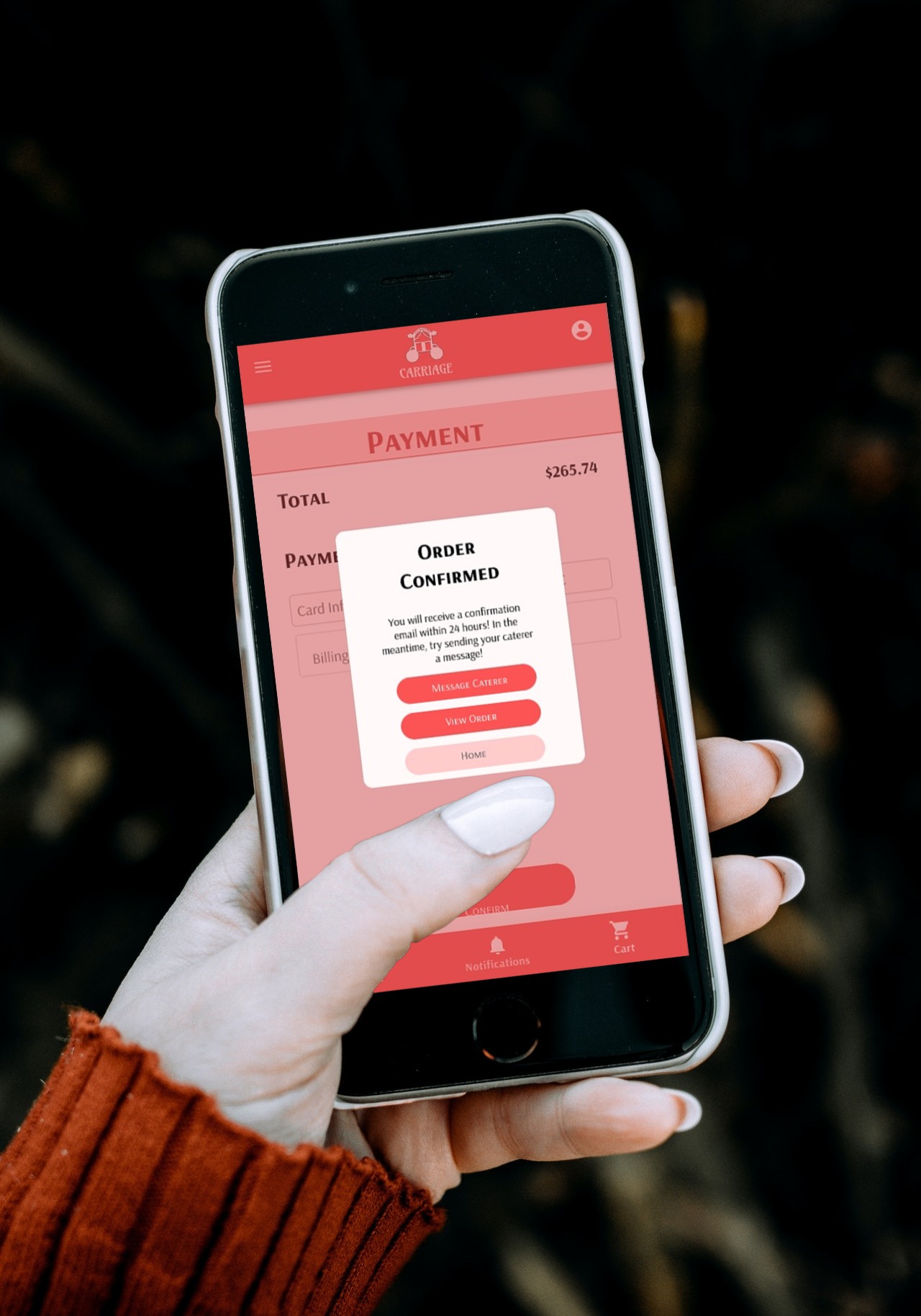
Final illustrated logo and product images for Carriage, the Japanese wedding catering app. Logo custom illustrated by me in Apple Procreate. Screens shown are the caterer's page, where users can view fully updated menus, read information about the caterer, or look at customer reviews and the order confirmation page that appears after payment.


